How to Fix E Ink Monitor Ghosting Artifacts When Typing Fast?
If your E Ink monitor looks clean while reading but turns messy the moment you type at full speed, you are not doing anything wrong. This is a common problem with E Ink displays.
Fast typing creates a stream of tiny screen updates, and that pushes the panel into a hard trade off between speed and clarity. The good news is that you can improve it a lot with the right settings, the right app choices, and a few simple habits.
In this guide, you will learn the practical fixes that matter most, which settings help first, and how to build a setup that feels calmer and easier to read even during busy writing sessions.
Key Takeaways
- The fastest fix is usually the refresh mode. If your monitor is set to a very fast mode, typing will feel more responsive, but ghosting often gets worse. A more balanced mode usually gives the best result for writing, coding, email, and note taking. You lose a little speed, but you gain cleaner text and less visual residue after each burst of typing.
- A regular full refresh helps more than people expect. Many users leave the screen in partial refresh for too long. That works for light reading, but fast typing creates many tiny updates. A timed or shortcut based full refresh clears the residue before it builds into a distracting layer. This is one of the most useful habits for daily work on E Ink.
- Your computer settings matter almost as much as the monitor settings. Smooth scrolling, animation, cursor effects, transparency, and soft font rendering can all make artifacts look worse. A simple, high contrast, low motion desktop gives E Ink less visual noise to redraw, and that makes typing look cleaner.
- Text style matters. Heavier fonts, slightly larger text, and a cleaner page layout are easier for an E Ink panel to redraw clearly. Thin fonts and crowded app layouts push the monitor harder. Clear text is easier to maintain than pretty text on an E Ink screen.
- Some ghosting is normal, and that does not mean the monitor is faulty. E Ink panels work by moving charged particles. They are great for comfort and reading, but they still have limits during rapid updates. Your goal is improvement, not perfection. Once you accept that, it becomes much easier to choose the settings that fit your work.
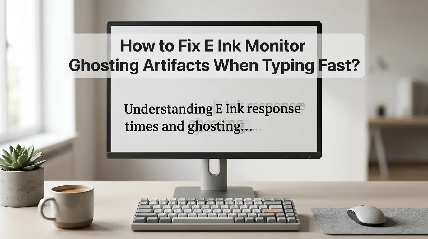
What E Ink ghosting looks like when you type fast
Ghosting is the faint shadow of old text or old screen elements that stay visible after the screen changes. On an E Ink monitor, this often shows up as soft outlines behind letters, dark residue in the margin, or a dirty layer around the cursor area.
During slow reading, you may barely notice it. During fast typing, it becomes much more obvious because the screen keeps trying to update many small areas at once.
This matters because your eyes start working harder to separate fresh text from old residue. That is where the screen begins to feel tiring instead of calm.
The first step is to identify whether the issue appears only while typing, only while scrolling, or all the time. If ghosting spikes during typing bursts, you are dealing with a refresh balance problem, not just a bad screen.
Pros: easy to spot once you know what to look for.
Cons: it can be confused with blur, poor contrast, or scaling problems.
Why fast typing creates more artifacts than slow reading
Reading a static page is easy for E Ink. The content changes rarely, so the panel has time to settle. Typing is different.
Every letter changes the cursor position, the current line, and sometimes the word suggestion bar, spell check marks, or the app interface around the text. That means one sentence can trigger dozens of micro updates in a few seconds.
Fast modes handle those updates by sacrificing some clean up, so old particles are less fully reset. That is why the panel feels faster but looks dirtier. The faster you type, the more often this trade off appears. This is also why users often report that typing looks worse than reading the exact same text later.
Pros of fast updates: lower delay and a more natural typing feel.
Cons of fast updates: more residue, softer letters, and a higher need for manual or timed clearing.
Start with the correct refresh mode
Most E Ink monitors offer several refresh modes. The exact names change by brand, but the idea stays the same. One mode focuses on image quality, one focuses on speed, and one tries to balance both.
If you are typing fast, the balanced mode is usually the best place to start. A pure speed mode may feel exciting for a minute, but it often creates more ghosting than most people can tolerate for real work.
Try each mode while typing the same paragraph for one minute. Watch the text area, the cursor trail, and the blank space around your last lines. The best mode is the one that stays readable after a burst of typing, not the one that looks fastest in the first five seconds.
Pros of quality mode: cleaner letters and less residue.
Cons of quality mode: more flashing and more delay.
Pros of balanced mode: a better middle ground.
Cons of balanced mode: still not perfect for every app.
Set a practical full refresh rhythm
A full refresh clears more of the old image and gives you a cleaner page. On many monitors, you can set how often this happens. If the interval is too long, ghosting piles up.
If the interval is too short, the screen flashes too often and interrupts your flow. For typing, a moderate rhythm usually works best. You want the screen to clear often enough to stay readable, but not so often that it breaks concentration.
A smart starting point is to test a short interval during writing and a longer interval during reading. If your monitor or software lets you change the refresh frequency, use that feature instead of guessing. Small changes can make a big difference.
Pros of more frequent full refresh: cleaner screen and less buildup.
Cons: more flashing and sometimes slower feel.
Pros of less frequent full refresh: smoother flow.
Cons: artifacts can stack fast during active typing.
Use a manual refresh shortcut you can hit instantly
One of the best fixes is also one of the simplest. Set up a manual refresh action that you can trigger without moving your hands far from the keyboard.
Some monitors support a hardware button. Some offer companion software with a shortcut. Some systems let you create a custom command or gesture. The goal is speed. If the refresh action is easy to reach, you will actually use it.
This works well because ghosting often builds in waves. You type for a while, the page gets messy, and then one clean refresh resets the whole view. That is much easier than fighting a dirty screen for ten more minutes.
Pros: immediate result, simple habit, low risk.
Cons: you must remember to use it, and too many manual clears can interrupt flow.
For many users, this becomes the single most useful daily habit on an E Ink monitor.
Lower visual noise with a cleaner color setup
E Ink monitors do best with simple, high contrast visuals. Busy color themes, soft gray text, and low contrast interface elements can make ghosting look worse than it really is.
Even on a monochrome panel, your computer may still send soft color shades that turn into muddy grays. That creates fuzzy text edges and makes old residue harder to ignore.
Switch to a clean light theme with dark text and reduce decorative colors where possible. A plain interface is easier for E Ink to redraw cleanly. If you prefer dark mode on a normal screen, test it carefully on E Ink before keeping it. Many users find dark interfaces look more smeared on reflective displays.
Pros of a simpler color setup: better text clarity and less apparent residue.
Cons: less visual personality and fewer color cues in some apps.
This change often helps more than people expect.
Make text easier to redraw with font and scaling changes
Thin fonts look elegant on bright LCD screens, but they often look weak on E Ink. Slightly heavier fonts hold together better during quick updates.
A modest increase in font size also helps because each letter gets more shape and more separation from the old residue beneath it. If your text is too small, even light ghosting can make it feel dirty.
Try a slightly bolder font weight and a slightly larger size than usual. Also reduce very narrow line spacing if your app allows it. Clear letter shapes matter more than fitting one extra paragraph on screen.
Pros of heavier text: easier reading and better redraw stability.
Cons: less content fits on one page.
Pros of larger scaling: fewer visual mistakes and better comfort.
Cons: more scrolling or more page changes.
For writing and coding, this trade often pays off very quickly.
Reduce motion and animation in your operating system
Animation is one of the quiet causes of ugly E Ink behavior. Smooth scrolling, fading menus, blinking effects, live window previews, and moving backgrounds all create extra updates that your monitor has to process. Even if you are only typing, the operating system may still be animating the cursor, tooltips, or small interface elements.
Turn off as much motion as you can. Disable smooth scrolling in apps. Reduce or remove desktop animation. Keep transparency low or off. A still screen is easier for E Ink to manage than a fancy one.
Pros: cleaner updates, fewer stray artifacts, and often better focus.
Cons: the desktop can feel less polished.
This is especially useful if ghosting seems worse in one operating system than another. Often the difference is not the monitor. It is the amount of motion your system is creating in the background.
Tune your editor, browser, and chat apps for E Ink
Some apps are simply harder on E Ink than others. Editors with sticky headers, floating toolbars, live previews, minimaps, and animated cursors create more redraw work.
Browsers can also be rough because many sites use moving banners, chat widgets, and constant layout shifts. If your typing looks terrible in one app but acceptable in another, the app is part of the problem.
Use a cleaner writing or coding layout when possible. Hide minimaps, reduce side panels, disable smooth scrolling, and turn off live effects you do not need. A simpler app window often gives a much calmer result.
Pros of a stripped down app layout: better clarity and fewer refresh problems.
Cons: you may lose a few convenience features.
This method works very well for people who write in code editors, note apps, or browser based document tools all day.
Check cable, resolution, and display mirroring choices
Sometimes ghosting looks worse because the monitor is receiving a less suitable signal. If the resolution is not matched well, text edges can look soft.
If scaling is awkward, letters may become fuzzy before the E Ink panel even tries to draw them. Mirroring can also create problems because the computer may optimize the output for a different display with different color and motion behavior.
Use the monitor in its native resolution whenever possible. Test extending the desktop instead of mirroring it. Also check whether a different cable or port gives a cleaner result. You are not just fixing the panel. You are fixing the full display path.
Pros: sharper source text and cleaner overall image.
Cons: setup can take trial and error.
If ghosting seems unusually bad after a cable swap or docking change, this section is worth checking first.
Update firmware, monitor software, and display controls
Manufacturers often improve refresh behavior through firmware and software updates. Newer versions can refine waveforms, adjust refresh logic, or improve the balance between speed and clarity. If your monitor has companion software, it may also offer shortcut controls, scheduled clearing, or better mode switching than the hardware buttons alone.
Do not skip updates if your device maker has a good track record. At the same time, keep a note of your current settings before you change anything. A better update can improve ghosting, but a reset can also wipe your custom setup.
Pros of updating: cleaner behavior, better control, and possible new refresh options.
Cons: settings may reset, and some updates change behavior in ways you may not like.
This fix is easy to miss because people often focus only on the panel and forget the software layer around it.
Know the pros and cons of each fix before you choose
There is no single perfect E Ink setting for every person. Each fix solves one part of the problem while making another part more noticeable.
A slower mode gives you a cleaner page, but the delay increases. More frequent refresh clears residue, but the flashing becomes stronger. Bigger text looks better, but less text fits on the page. That is why the best setup is usually a personal compromise.
Think about your real task, not the ideal screen. If you write long drafts, readability matters more than raw speed. If you do quick edits, you may accept a little dirt for a faster feel. The right answer depends on the job in front of you.
Pros of a clarity first setup: calmer reading and less eye effort.
Cons: slower interaction.
Pros of a speed first setup: quicker feel and less input delay.
Cons: more artifacts and more cleanup work.
When ghosting means you have reached the limit of the panel
Some ghosting is fixable. Some is simply part of the display technology. If you have already tested the refresh modes, adjusted the refresh rhythm, simplified the desktop, improved the font settings, and updated the software, but the screen still looks messy during fast typing, you may have reached the limit of your specific panel.
Older panels, color E Ink panels, and some aggressive fast modes will always leave more residue during heavy input.
This does not mean the monitor has failed. It means the screen is being asked to behave like a fast LCD while still acting like E Ink. The practical fix at that point is workflow design. Use E Ink for writing, reading, review, and calm editing. Move highly dynamic tasks to a regular monitor if you have one.
Pros of accepting the limit: less frustration and a better fit between tool and task.
Cons: you may need a mixed screen setup instead of a single screen setup.
FAQs
Why does my E Ink monitor look worse when I type than when I read?
Typing creates many small updates every second. The screen has to move the cursor, redraw letters, and refresh parts of the interface. Reading keeps the page mostly still, so the panel has more time to settle cleanly.
Which refresh mode is usually best for typing?
A balanced mode is usually the best starting point. It tends to keep enough speed for typing while reducing the heavy residue that appears in the fastest mode. The quality mode can look cleaner, but it often feels slower.
Should I use dark mode on an E Ink monitor?
You can test it, but many users get cleaner results with a simple light theme and dark text. Dark mode often makes text and interface elements look softer on reflective screens, especially during quick updates.
Is frequent full refresh bad for the monitor?
Normal use of the refresh function is part of how E Ink screens are meant to work. The bigger issue is comfort. If the screen flashes too often, it can break your focus. That is why a practical interval or a quick manual shortcut works better than constant full refresh.
Can firmware updates really reduce ghosting?
Yes, they can help. Firmware and monitor software may improve refresh behavior, add better control options, or refine the balance between speed and clarity. The gain depends on the brand and model, but it is always worth checking.
What is the best overall fix for fast typing ghosting?
Start with three steps. Use a balanced refresh mode, set an easy manual refresh shortcut, and switch to a cleaner high contrast text setup. Those three changes solve the problem for many users without making the monitor feel too slow.

Hi, I’m Jessamine Rowell, the founder and voice behind ResizeMake (https://resizemake.com/), a space where I share my love for technology with the world. I write detailed and honest reviews on the latest tech products, gadgets, electronic devices, and trending Amazon items to help readers make smarter buying decisions.